One need not be an architect or designer to understand the role colour plays in any urban space. It contributes to the visual memory associated with a built form, and can also act as an involuntary local marker. An evocative report by TMD Studio, a London and Prague-based architectural practice, states:
“Colour is a sensory perception, and as any sensory perception, it has effects that are symbolic, associative, synesthetic, and emotional.” [1] The term “sensory perception” is of note here. While colour can help significantly in highlighting the unique characteristics and features of structures, it goes beyond simply being a function of aesthetics.
As far back as the Upper Palaeolithic period, the coloured pigments used to paint figures in prehistoric caves also carried great symbolic meaning. Prior to its mass-production, the use of colour has also been a symbol of prestige and wealth, being associated with the social power and dominance of groups that could afford it when it was a rare commodity.
The colours visible in Mumbai certainly have a long history of use and display. The city developed in the 19th century, when seven islands were merged to form a single landmass. Since then, Mumbai has undergone several urban cycles of development and redevelopment. With each cycle, there has often been a shift in design and colour palette, making the urban form one of the many transient qualities of Mumbai’s bustling nature. Understanding the colours that adorned Mumbai’s buildings, however, would also be a method to understanding the history of the city’s urban form.
While examining the Art Deco ensembles in the city, which emerged as a modern style in the early 20th century, the colours of these structures become significant. Though they have never been looked into adequately, they are one of the more important aspects of the design, drawing attention to the Deco motifs and streamlining in many of these buildings, and lending to unique storytelling through painted bas-relief patterns or concrete grilles.
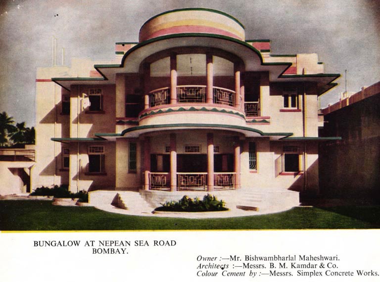
In the following essay, an attempt has been made to analyse the paints and materials used to embellish Mumbai’s Art Deco buildings since the 1930s, through a study of advertisements by paint manufacturing companies of the period. These advertisements have been primarily taken from various issues of the Journal of the Indian Institute of Architects, from the 1930s to the 50s.
Looking at the products being advertised by various paint companies provides an insight into how the paint industry evolved, the ideas and aspirations that came to be associated with a certain modern aesthetic, and the economy of Mumbai’s chosen colour palettes. What were the colour trends in the market when these Art Deco buildings were being built? Who were the socioeconomic groups that patronised this style? Did these paints and materials do more than simply beautifying the facade of the buildings? These advertisements open up a window into the early 20th century, providing insights into the concerns of building at the time, the materialities involved, and importantly, the passion for building vibrant and playful structures that did not compromise on aesthetics.
Art Deco Colours in Mumbai: A Short Context
Originating in the Back Bay reclamation, Art Deco arrived in Mumbai when Indian royal families, entrepreneurs and merchants of the widely-travelled and educated upper-middle-class began to adopt contemporary design trends they had seen in the West.[3] The Deco houses and apartment buildings had flat roofs, curving windows and a variety of ornamental motifs. Favoured decorative patterns and tropical imagery as bas-relief works were observed with streamlining, bold horizontal forms and pastel colours.[4] The colour selection and colour schemes employed in these structures highlighted the aforementioned features, and often became markers of a design identity.
As the style flourished in the city from the early 20th century, it also spurred an industry of paints and construction companies. With the plethora of colour palettes now available to architects and urban planners, Art Deco as a style saw constant evolution in trends. This is why the messaging these companies put out, especially in print advertisements, becomes an interesting site to observe these changing trends and aspirations associated with Art Deco.
The following sections take a closer look at these communication strategies, which unveil some aspects of how colours were selected during the Deco boom, and what the use of these colours and materials may have been symbolic of.
Companies that Coloured Mumbai’s Deco – the 1930s
Notable paint manufacturers like Killick, Nixon & Co., Shalimar Paints, Goodlass Wall, Ltd. (subsequently Goodlass Nerolac Paints, and now Kansai Nerolac Paints Ltd.), to name a few, have contributed vastly to painting these Art Deco buildings in Mumbai. Companies like Simplex Concrete Works and Bharat Tiles have also taken up the construction work of many such buildings in the city.
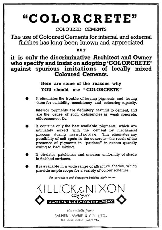
Killick, Nixon & Co. were popular for their wide range of colour options, which they claimed were inspired by nature. One of their popular products from this period is coloured cement, also known as “Colorcrete”.
These were cement products that did not require another surface coat of paint, as coloured pigments were already permanently mixed in the cement, at a cost nominally above the ordinary variety. It was a remarkable product that quickly became popular among architects, for the far greater durability it provided when compared to a regular paint finish.
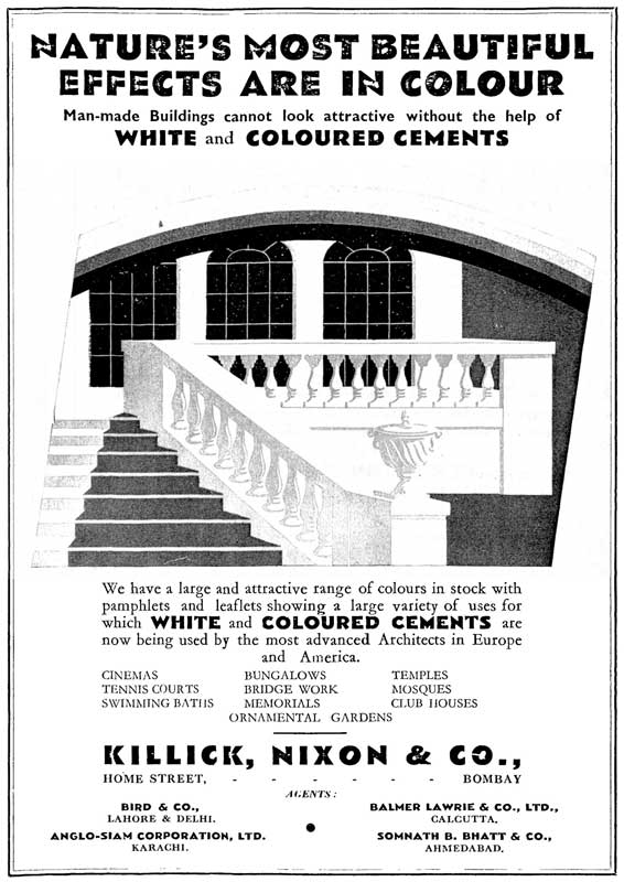
Colorcrete also brought an aesthetic dimension to basic construction material, and showcasing buildings with vibrant colorcrete accents became an important marketing strategy for the company. An advertisement by them (Killick, Nixon & Co.), found in a 1939 journal, talks about the characteristics of this unique product.
While the advertisement (shown below) refers to surface elements like the uniformity of shades and variety of colour schemes, there is a greater emphasis on making a structural case for colorcrete, asserting that the pigments used in the cement will make the concrete stronger.
There is also a reference to “spurious imitations” in the market, as the advertisement calls on people to use only colorcrete, indicating that the concept of coloured concrete had caught the imagination of the city’s Deco landscape.
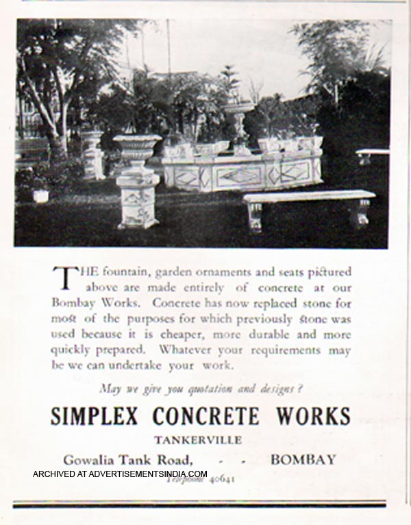
Other contractors, construction companies and concrete manufacturers also followed suit by endorsing their versions of coloured cement. Simplex Concrete Works, for instance, used elements of coloured cement for constructing several renowned Deco buildings, such as Belvedere Court in Oval Maidan, Shah Baug in Cumbala Hill, and Bahadoor Manzil in Fort. The ease of construction and durability of products associated with coloured concrete became the unique selling point for the company.
An advertisement from 1938 (shown below) draws attention to concrete as a cheaper, more durable construction material than stone, one of its greatest advantages being that concrete could be “quickly prepared”. There is a clear shift away from stone as a building material in this period, as seen in the modern Art Deco precincts that emerged in various parts of the city, starting with the row of apartment buildings near Oval Maidan in the 1930s. The abundance of advertisements for concrete and cement at the time corroborates the same.
In fact, the very presence of a plethora of paint manufacturers in the market was an indication of a new, modern building style emerging with concrete, which enabled facades to be painted in various hues. As these paint companies gained popularity, they also endorsed products with unique characteristics and a wide range of colour options. These endorsements often targeted architects by highlighting the functional aspects of the colours, different types of paints, and their qualities.
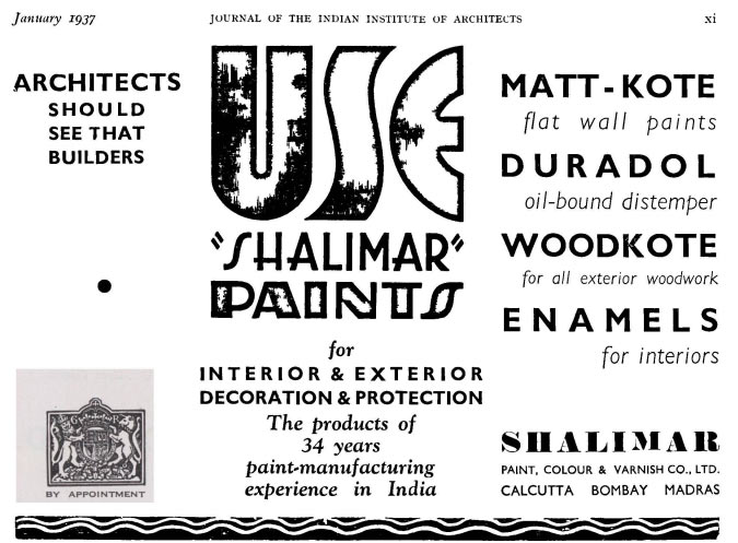
As seen in this advertisement on the left, published by Shalimar Paints in 1937, the various uses of materials like ‘Matt-Kote’, ‘Duradol’, ‘Enamels’ and ‘Woodkote’ have been described in some detail. The company’s versatility is emphasised as the advertisement showcases an inventory that takes care of all paint needs a building may have.
Founded in 1902, Shalimar Paints is still a renowned paint manufacturer in the market today, and has witnessed the Art Deco style take shape in India from the early 1930s.
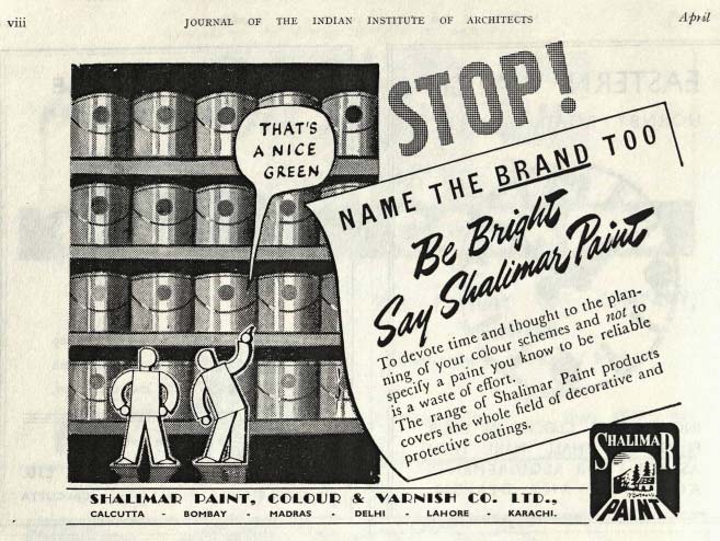
Their attempts to make their name a brand can be seen in the company’s tagline and advertisement campaigns.
In this advertisement on the right, from a 1937 journal, the tagline ‘Be Bright, Say Shalimar Paints’ incorporates the name of the company to make it synonymous with bright colours and a wide range of shades. There is also a focus on their paint manufacturing experience.
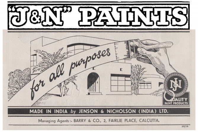
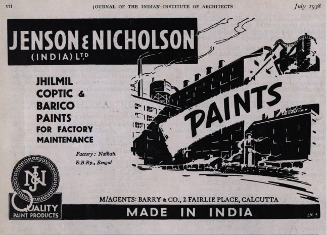
Another company, Jenson and Nicholson (now known as Berger Paints), provided a multi-purpose range of paint colours, which even extended to industrial paints.
By the late 1930s, it became apparent that paint products needed to have both quality and varied functionality, other than just colour. This is reflected in the new products appearing in the market around this time. Primers, for instance, began to gain popularity as essential products to ensure durability and better adhesion of paints.
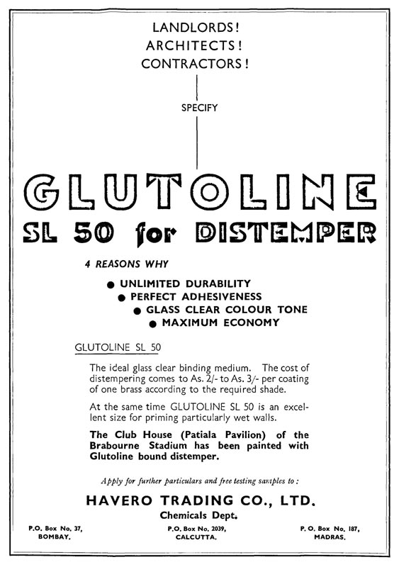
By the end of this decade, there is also a greater move towards climate-responsive designs, which is incorporated into the paint products.
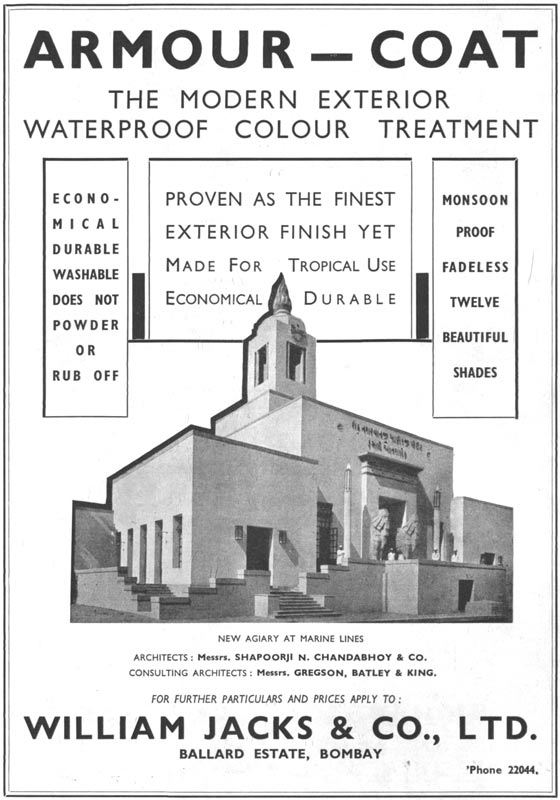
An example of this is the appearance of a waterproof quality in newer paint products. William Jacks & Co. Ltd., for instance, used a photograph of Modern Agiary (also known as NM Petit Fasli Agiary) in Marine Lines, Mumbai, a renowned local marker, as can be seen in the advertisement on the right.
The messaging drove home the point about waterproof colour treatment on the agiary’s external surface. Though the colour scheme had muted pastel colours, the waterproof and weatherproof characteristics of the treatment were hugely beneficial for building owners in a coastal city like Mumbai, which bore the brunt of a tropical monsoon for three to four months in the year.
Companies that Coloured Mumbai’s Deco – the 1940s and 50s
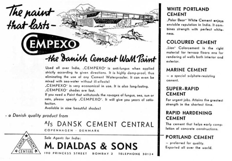
Paint and concrete products continued to be in active use during the 1940s and 50s. As was the case in the preceding decade, every company resorted to building their brand image by amplifying the variety of products, colours, and unique qualities provided by them. Cempexo, for instance, provided different types of coloured cement products supported with properties suitable for coastal areas.
These products were advertised as being convenient and prompt in application, durable and colourful. The company even went so far as creating an “anti-fungus” wall paint that can be “mixed with sea-water without ill-effects!” – perfect for use in a coastal city like Bombay.
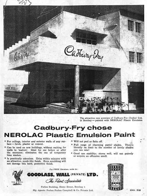
Companies like Goodlass, Wall Ltd. also showcased the buildings painted by them, highlighting the functional qualities of the paint finish. An advertisement from a 1957 journal, for instance, displays the Cadbury Fry building (since demolished), which was a famous landmark at Bhulabhai Desai Road, Mumbai. The advertisement draws special attention to the company’s plastic emulsion paint products and various other characteristics, like durability and an odourless finish. “There’s literally no limit to the number of lovely shades you can mix!” the company goes on to assert.
Another advertisement from 1954 highlights the versatility of the paints, as the company claims they were used not only for buildings, but also provided protection against rust and corrosion to luxury ocean liners like the “Queen Elizabeth”.
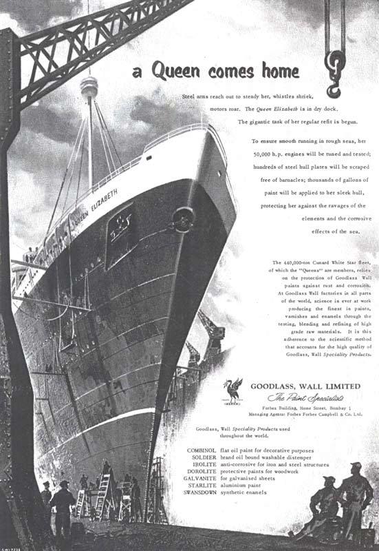
These liners were the epitome of luxurious and glamorous travels in the early 20th century. Queen Elizabeth, in particular, was referred to as the “mightiest ocean liner ever built” when it first set sail, and was built as a sister ship to “Queen Mary”, the British ocean liner that sailed between Southampton and New York twice a week.[6] These luxurious ships represented the allure of discovering new frontiers, and the modern individual’s ability to lead a glamorous, jet-setting lifestyle through these sophisticated modes of transport. This 1954 advertisement seems aware of what the ocean liner represented in the modern world, and cleverly builds on this idea in its messaging.
Being the trusted paint of choice for this liner, which offered the ultimate experience in mobility across the ocean, and which received the British crown’s patronage, became the greatest endorsement for Goodlass, Wall Ltd. It was a company that understood modern aspirations of mobility, luxury and efficiency, and was competent enough to bring the “Queen” home, as the advertisement declares. “At Goodlass Wall factories in all parts of the world, science is ever at work producing the finest in paints, enamels and varnishes …” reads the poster.
Incidentally, only four years prior, in 1950, the company’s push for the value of science and research in developing quality paint products was juxtaposed with the notion of the unscientific “native”. This was an unusual campaign about cultural differences based on colour, not of paint but of people. The campaign repeatedly uses the trope of the ‘civilised’ man versus the ‘savage’, arguing that the company uses science and modern technology to make reliable paints, unlike the “crudely mixed” pigments of the natives.
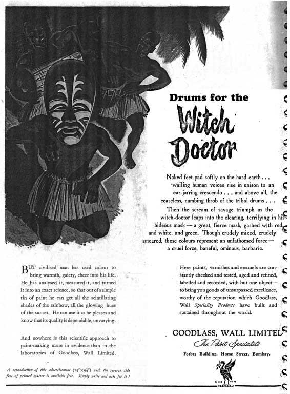
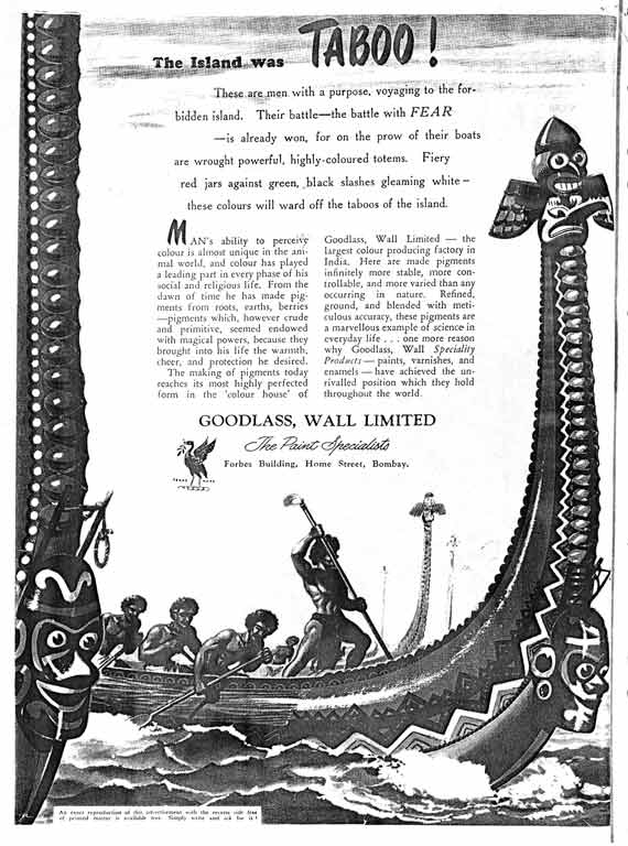
Notably, while the advertisements were typically addressed to Indians, the figures in the illustrations of the print campaign frequently resembled Native Americans. It seems it took a few years for the ‘Swadeshi’ sentiment to catch up with the firm.
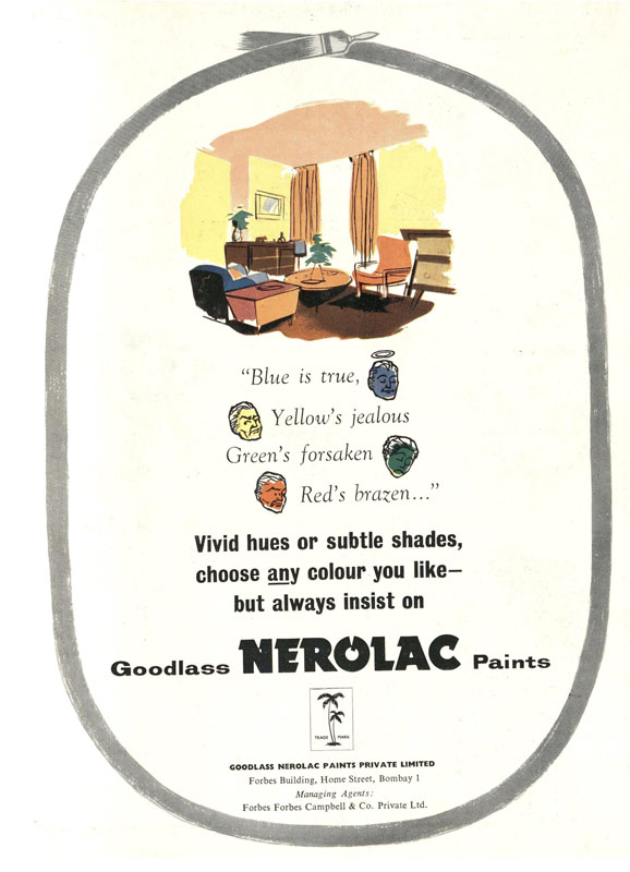
From all the advertisements presented above, one gets an insight into not only the wide range of colours and pastel shades available to paint the city’s Art Deco buildings, but also into the prevailing trends in the market, the innovation of paint companies in response to the climate needs of the city at the time, and the ingenious ways in which these buildings were made more habitable while also maintaining the aesthetic of their facade.
As the large-scale production of colours became simple, it is clear that the companies started shifting their focus to materiality, additional characteristics, and quality of the paint products rather than just the colour shades. Aspects of functionality, such as waterproofing, durability, longevity, and weatherproofing became the priority, which also became noticeable in the advertisements of the following decades.
In Conclusion
The rapid rate of transformation in the city’s urban landscape is one of the major challenges of documenting Mumbai’s Art Deco heritage. With decades of renovations, weathering and neglect to contend with, it becomes challenging to ascertain what a building looked like in its original form. A look at the companies that played an active role in colouring Mumbai’s Deco buildings, therefore, presents evidence of the paint manufacturers’ responsiveness to prevailing trends, the psyche of the customers, and most importantly, the materials available at the time. It is through an analysis of these advertisements that one can learn of materials such as coloured concrete, which is visible in Deco buildings across the city and could otherwise be easily mistaken for regular paint finish.
A survey of these advertisements also presents evidence of the building materials used, especially in a city like Mumbai. Repeated references to the ‘weatherproof’ and ‘waterproof’ characteristics of the paints is an indication of the market’s demands at the time. Notably, one also gets interesting insights into prevailing societal discourses. The campaign carried out by Goodlass, Wall Ltd. in the early 1950s, for instance, reveals that a blatantly Orientalist advertisement was not only accepted but could also be commercially successful.
Most importantly, a look at the companies that coloured Mumbai’s Deco, and the products they positioned in their print campaigns, becomes an important resource to supplement the limited archival material available. These campaigns would often weave in local narratives and make references to significant events and headlines. As much as they painted the buildings of the time, they also paint a picture of the times.
Priyanka Baghel for Art Deco Mumbai
Priyanka Baghel has graduated from the National Institute of Technology, Raipur and is currently pursuing her Master’s degree in Conservation and Regeneration, from the Centre for Environment Planning & Technology (CEPT), Ahmedabad. Her interests include documentation, learning about history and creating heritage awareness.
This is an excerpt from a report commissioned by Art Deco Mumbai Trust, ‘Decoding Mumbai’s Deco Colour Codes’. The research is based on the building inventory owned by the Art Deco Mumbai Trust. All external resources were made accessible by the Art Deco Mumbai Trust. Edited by Suhasini Krishnan for Art Deco Mumbai. Digital illustration for header image by Maulika K Hegde, for Art Deco Mumbai.
