The art of arranging letters as they are seen on road signages, in newspaper advertisements, or outside popular watering holes in the city, is one that is deliberate and considered. Some of the oldest signages seen in Mumbai (in the name on a building or a painted board outside a shop) may have followed established traditions of lettering and the development of typesetting techniques in the early 20th century. The city’s Art Deco has a close relationship with the art of lettering, as distinct geometric lines come together to form building names and lend them their identity. Liberty Cinema at Marine Lines, among other things, is recognised by its vertical marquee that is decorated with piano keys and the name of the cinema, which once shone in neon light. A landmark in itself, the deliberately chosen style of lettering for the cinema is one of its distinctive markers.
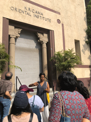
The letters we encounter everyday are not incidental, and Mumbai-based Typographer and Type Designer Tanya George has a unique way of seeing them. With over a decade of experience in Graphic Communication and Identity Design, and an M.A in Typeface Design from the University of Reading, UK, Tanya has built an interesting practice around letters in the city, old and new. In this conversation with Suhasini Krishnan and Theertha Gangadharan, for Art Deco Mumbai, Tanya speaks about getting interested in type design, the various meanings behind the lettering in Mumbai’s built form and how they may have transformed, and some of her favourite type sightings from around the city. Excerpts:
What got you interested in type design? Why and how do typefaces make you tick?
I always loved letters. Even in school I’d be scribbling designs for favourite bands at the back of my notebook. College allowed me to pursue it more formally, but it was only once I started practising graphic design I realised how much I enjoyed letterforms, which led me to an MA in typeface design. Typefaces to me, at their core, are a tool for expression. But what I love about them the most is how they are used by people. The way they are transformed and interpreted allows me a glimpse into how people make decisions. I also enjoy placing the designs historically – because of how fonts have evolved over the centuries, they contain the histories of technological advancements in their application.
Is there a typical brief for your projects as a type designer? What does it look like? Tell us about your practice and who should be approaching you.
I design letterforms for brand identities as well as fonts across different Indian scripts. I also write about type, and conduct Type Walks around Mumbai, along with typography workshops. So whether you have a logo to design, want a companion to an existing one in an Indian script, want to create a font based on an existing sketch, or you just love letters and want to know more, there are tons of reasons to reach out to me.
How has your formal education helped make your work more distinct from someone who is casually experimenting with graphics and type design?
I think two major benefits I received from a formal education was a deeper understanding of the history of the subject, and an exposure to the industry and its people. This meant I could collaborate and work remotely with people from all parts of the world, even though I’m based in Mumbai. But I also know a ton of amazing type designers who don’t have formal degrees, so I dont think it’s a prerequisite to become a type designer. Casual experimentation is a great starting point, but type design is an extremely iterative process, which means you need the time and patience to practise it. I think that is true for anything you want to pursue in a meaningful way.
Could you explain the relevance or importance of typeface design in creating the identity of a public space? Are there signages that you immediately associate with a certain place in the city or with a memory?
Typography is an important visual tool that can reflect the intangibles of a space. It’s a gradual association that becomes part of the experience. People may not always be able to identify a typeface, but in its absence they would be able to sense a change. An obvious example for this is signs for local stations in Mumbai. You’ve come to expect them in certain kinds of letters, in that diamond-shaped board. Earlier the letters used to be hand painted, and though there is a shift to fabricated boards now, the look and feel still tries to be consistent. This consistency is helpful for directional signages and location markers, but when it comes to a shop or an establishment, the sign needs to be inviting to customers. It’s also helpful to have a recall value.
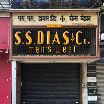
Besides, fabricating signs in metal or wood is a dying art, so shop owners resort to digital prints or acrylic solutions, which rely on existing fonts and outdated computer software, leading to limitations in the possibilities of the design. The sign for Poornima restaurant in Fort had served it well for decades, and included a small hand painted board announcing the specials. All of this unfortunately got a recent downgrade. The restaurant now has a basic signboard with digital fonts, which follows the regulations about keeping the Marathi sign as the largest on the facade.
How did Deco lettering come to be? Could you share a brief historical context?
The term Art Deco came to be used for a modern style that gained popularity in between the two World Wars. After World War I, travel for leisure started becoming popular. We see advertising for destinations, which reflected the new and swift options of transportation like trains, ocean liners and aeroplanes. The uncomplicated design of the typefaces used in these advertisements reflected a streamlined form. The geometric forms of the letters and the symmetry of the artworks were considered modern for its time, when viewed in contrast with the ornate and expressive forms of the Art Nouveau designs that came before it.
As new materials started becoming popular, newer forms were created to work better with the designs. The geometry and symmetry made possible in architecture with the introduction of cement was reflected in the signages that came up on Art Deco buildings. As stainless steel became a popular choice for signs, owing to the longevity of the designs, they allowed for designs of letterforms to become sleeker and look more sophisticated. You see a lot of this in Art Deco buildings in the city to this day.
The early 20th century is known for vivid experiments with type design. Building facades, signages, print advertisements were replete with a gamut of styles emerging in lettering. What about this period facilitates this boom?
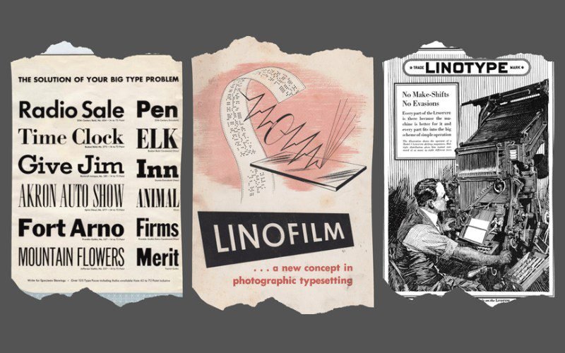
I’m not sure about experimentation, but the 20th century is known for the mechanisation of font production and typesetting techniques. Machines like the Linotype and Monotype, as well as other similar machines, allowed for mass production of printed matter, which in turn led to a meteoric increase in printing and circulation of books and periodicals.
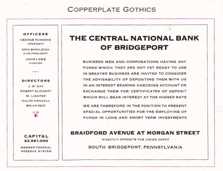
Towards the later half of the century, we see a dematerialisation of typefaces, first as phototypesetting machines and eventually as fonts that could be stored digitally on a computer. This churn in technology needed to be supported with readily available typefaces. Consequently we see designs, which were earlier limited to a particular size in the letterpress era, being scaled up or down to sizes they were not designed for. Copperplate Gothic is an example of a design created for headlines, in which minute serifs accentuate the flat terminals. But when used in the signage for a building, since digital fonts allowed for it to be scaled up, the tiny serifs become disproportionately large and start looking like proper serifs, clashing with the gothic or sans serif feel of the design, with no benefit to the sign.
We found this exciting advertisement for neon signs from a 1938 edition of Filmindia magazine. There is so much happening in this advertisement when it comes to type and shapes. How would you respond to this layout?
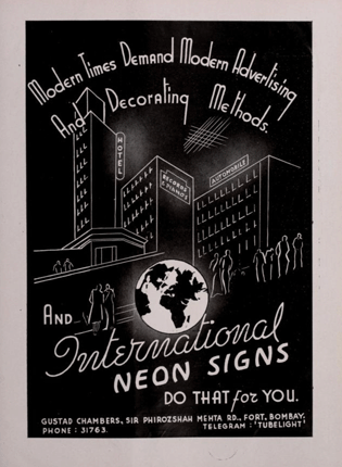
This layout for neon signs is most likely a piece of lettering etched into a metal plate, like the cross hatching seen below the word ‘Method’. Also, letters that repeat themselves look different, which means that they were hand drawn as opposed to typeset. The advertisements for Pond’s Cream below, on the other hand, are typeset using various metal fonts of the era.
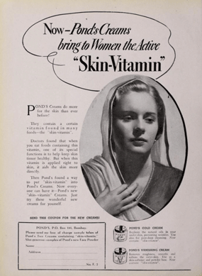
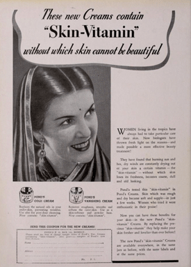
Simply look at the headline in the advertisement on the left. The word “Now” has an upright font, while “Pond’s Cream bring to Women the Active” uses an Italic style that is traditionally slanted. “Skin-Vitamin” is at a much larger size, which means it is a third font in this layout, and there are five more in the text below!
Letterpress fonts were physical objects, so to create a layout you had to arrange these tiny stamp-like objects next to one another. Any gaps were created by placing a physical object of a shorter height, so that area would not be printed. In printer-speak, these physical objects are commonly known as ‘furniture’. You can “see” the furniture most prominently in the gaps between the various paragraphs. These fonts were selected for the size they were used at and the space available to them. If you look at “Skin-Vitamin” in the two advertisements, the one on the left has a narrow design as compared to the centre-aligned title on the right. The same font came in different widths to do the job, but unlike the drop down menu in a computer we can select from today (to format fonts and styles), these were handpicked and arranged by a printer, who had the ability to identify letters in their mirrored forms (as they needed to be flipped so they would print the right way).
Did Art Deco have a stylistic influence on typeface designs and can you introduce us to that?
Travel posters in the early 1920s were one of the earliest places you can see what is today known as Art Deco letterforms. Sans serifs had already been around for a century, but the promotions of ocean liners and aircrafts led to the creation of streamlined letters which captured the spirit of the times, and emphasised the speed and efficiency of these modes of transport.
Today it is A.M Cassadre, a French designer who is credited with the first Art Deco typeface, ‘Bifur’, which came out in 1929. Bifur is a mix of thick and thin strokes paired in an unusual manner. The design is striking even today so one can imagine how groundbreaking it would have looked when it first came out in 1929. Since then, the play between thin and thick, paired with geometric forms and symmetry, are some key features of Art Deco letterforms.
Across Mumbai’s built form, we see varying expressions of vernacular identities, especially in the naming conventions and signages. Have Indian language scripts been adapted to Deco styles?
Art Deco typography enjoys multifaceted interpretations in Indian languages. Hindi words like ‘Kunj’ were written in English but as was bound to happen, Indian scripts were also interpreted for Art Deco. Just among the Bombay Deco buildings, I’m amazed to see a range of expressions, and some parallels with their English counterparts.
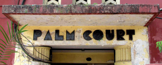
The Devanagari letters seen in Shreenivas (श्रीनिवास) have bulbous, softer forms and filled in counter spaces (the spaces inside rounded letters such as a, c, d) which are visible in a lot of English Art Deco signs, for example at Palm Court, Oval Maidan.
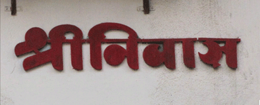
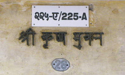
Those bulbous forms and crescent terminals are in strong contrast to the severely geometric forms of Shri Krishna Bhuvan (श्री कृष्ण भुवन), which seems to be made entirely of straight pieces of metal.
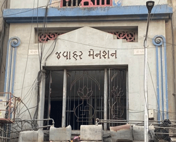
An absence of curves is seen again in Jawahar Mansion’s (જવાહર મેનશન) engraved Gujarati sign.
The signs for Kumar Vilas કુમાર વિલાસ and Mangal Bhuvan મંગલ ભુવન, two adjacent buildings with a similar architecture, also have matching styles for their signages. The elongated Gujarati letters are fitted on a curved wall at the entrance of both the buildings.
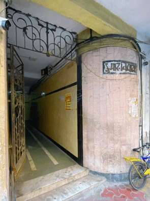
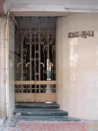
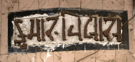
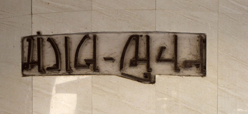
Both the English and Marathi signs for Art Deco buildings also show cursive styles that seem to prefer fluid, connected and swashy compositions, in contrast to the geometric forms of the buildings themselves. These interpretations make the Indian scripts look futuristic because they are so divorced from the calligraphic forms we are used to seeing them in traditionally.
How has the art of lettering changed? For example, in the 1930s, what would have been the process of creating lettering? Do we know anything about the people working with lettering at the time?
It has become far more of a digital process. This is true for a majority of the graphic arts where the computer allowed for the democratisation of design. What was once first sketched on paper and then chiselled on stone, or shaped out of wood and moulded out of metal, is now dematerialised onto a screen. There is also a separation of roles where once the craftsperson creating the piece of lettering was trained in it for years and had a say in the design. Today, a design created on a computer can be reproduced using a variety of materials, and sometimes created without even considering the final size and material, because fonts are no longer a physical object designed with the intention of being used for a particular purpose. They can now be scaled up or down from a drop down menu.
How have you seen a change in signages over a period of time? Do you feel there has been a loss of individuality and personality, or has standardisation of font (through digitisation) been some kind of equaliser?
I touched on more recent changes seen in Maharashtra earlier but the overarching change across the past few decades is the introduction of the computer as a tool of design. The limitation of materials earlier meant that certain designs suited for metal could not be created in wood and vice versa. But with the dematerialisation of letterforms, any shape can be printed onto a flex banner. Plastic can be moulded or lazer cut to create forms that were once not possible. The size of lights has shrunk so they can fit behind the tiniest letters to illuminate them.
So there is still a lot of variety at play. The loss of individuality and personality you speak about can also be attributed to this dematerialisation to an extent. Designs are now created on a tiny screen but scaled up by a printer and then mounted on a signboard. We are also limited by what is taught in design schools. If curriculums are not designed to educate students about Indian typography and typesetting, that will show in the graphical output. In an idealistic scenario, design education would be far more accessible to people from various parts of this country and available in Indian languages, so English speaking designers would not be the ones designing all advertisements, branding and signage.
Do you envision a future where lettering is redundant? Several well-known contemporary brands are recognised simply by symbols or logos, like Apple or Nike, Closer home, there’s Amul or Hindustan Unilever. Emoticons have also become a popular way of communicating. Where does lettering stand amidst all this?
Lettering is not limited to just brand marks and logos. You could letter a sign or page in an editorial text. Lettering can be used for covers of books or for environmental signage. Text defines things explicitly and as long as text is a form of communication, lettering will be a form of expressing it. As far as these brands go, whether Indian or international, they might be recognised without their text but that recognition is built on decades of having text associated with the iconography. And their ads will still require text in the form of captions. A lot of larger brands tend to have custom typefaces for their exclusive use, to build out this very brand association. In many cases this is based on the text in their logo. So text is not going anywhere and neither is custom designed lettering.
Do you have examples of signages in the city that you think are falling short from a typographer’s point of view?
Court View uses Copperplate which is a font designed in 1901, so that definitely does not suit the Art Deco building it’s used to identify. The tiny wedge serifs are better suited to smaller sizes, and ideally in print, as opposed to the large metallic sign it is produced on. I have a whole typewalk where I talk about this in detail, but maybe Zara can do a better job in creating a Marathi version of its logo which it displays on its entrance. For the prices that Hermes products retail at, I’d imagine they could afford a designer to work on their signs. I’m available should they be interested in improving the Devanagari sign : )
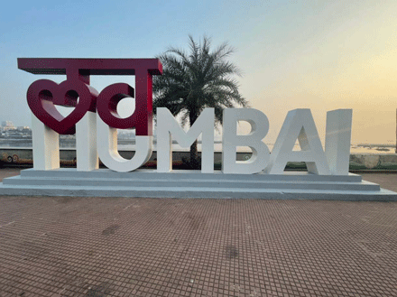
We have to ask? Is there a Tanya typeface and is it patented? If so, please tell us more.
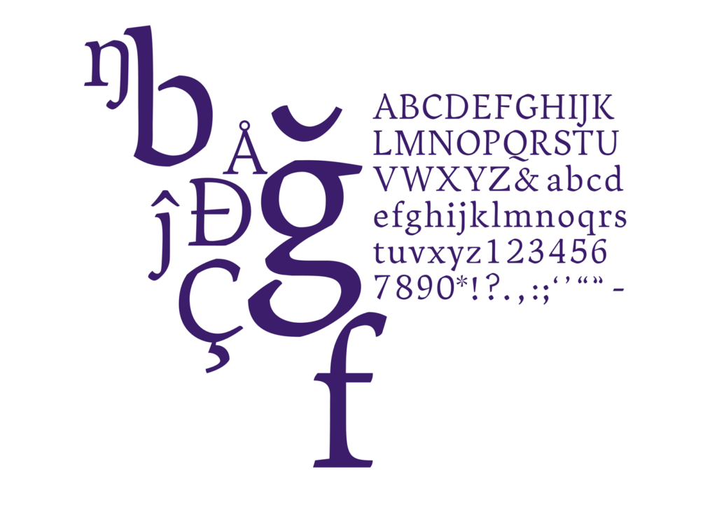
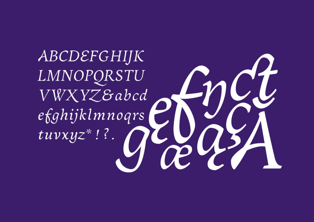
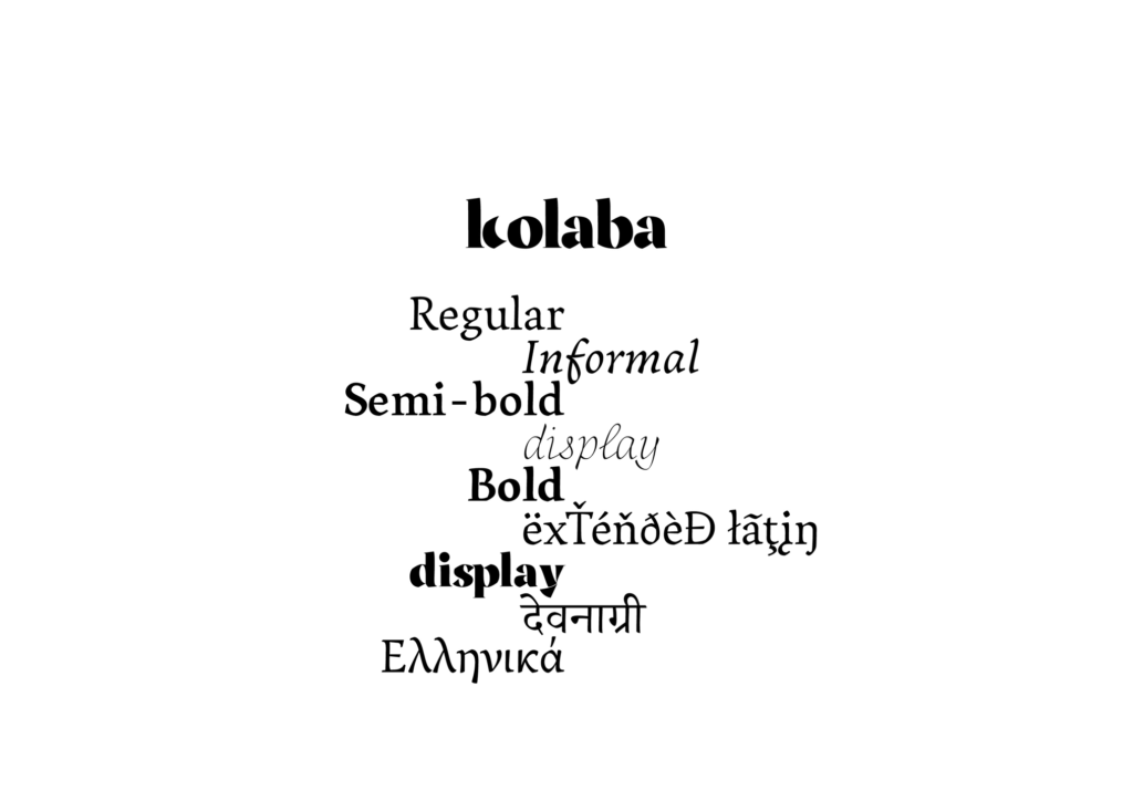
I’ve been working on a whole bunch of fonts. The most recent one is Ransom Deco based on Art Deco signage around Mumbai. I have some more Deco and Nouveau based designs, as well as my graduation typeface called Kolaba that supports Latin, Devanagari and Greek. These are WIP designs and not yet published but if you want to use any, just drop me a line. We can figure something out.
